In detail: do-it-yourself kitchen repair in a private house from a real master for the site my.housecope.com.
Several years ago, after a fire in my parents' house, we were forced to move into a new building: there were no interior partitions, no decoration, or even floors in the house: walls in brick, ceilings and floors - reinforced concrete floor slabs. The floor was laid with chipboard on beams with the installation of insulation mats "Isover", interior partitions - partition blocks made of gas silicate blocks. The furniture rescued from the fire was moved ...
As we continued to live, we had to do everything in stages. Four years passed and the turn came to the kitchen. There were many family disputes over the design: the premises were not standard and not very comfortable; three different directions were determined by color; financing only from wages. We needed a comfortable and budget option. It is clear that today is a problem. Combining comfort with a budget has always been a challenge. Prices for kitchens, materials and work are not low. But I am satisfied with the result and I want to share my solutions with you. In general, first things first.
How does any repair begin?
On sites on the Internet there are a lot of informational articles and videos describing all the construction "wisdom". We read several dozen descriptions of repairs, watched a lot of "videos". At the family council, they came to the conclusion that at the first stage it is necessary to decide on a set of preparatory work:
- floor and decoration;
- ceiling and decoration;
- walls and decoration;
- window and slopes;
- power supply: indoor lighting, sockets;
- decoration of doorways and doors.
All necessary measurements of floors, walls, ceilings, windows and doorways were performed first. A detailed layout of the premises has been drawn up.
| Video (click to play). |
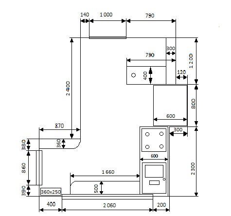
The layout of the room for the kitchen:
According to the measurements obtained, it turned out that the size of the room belongs to the middle category. According to the configuration, it is not very convenient for placing kitchen furniture.
Finishing colors were chosen taking into account the location of the premises in the house. The only window faces the east side of the building. Accordingly, the side is "sunny". However, the climate has changed a lot in recent years and there are already much fewer sunny days per year. Therefore, the colors were chosen mainly for artificial lighting.
Further, options for finishing floors, ceilings, slopes and walls were selected:
- they decided to make the ceiling suspended from plasterboard sheets with LED lighting.
- plaster and paint the window slopes.
- for the decoration of the walls, the choice also settled on plasterboard sheets. On the walls that will be behind the kitchen furniture, use moisture-resistant plasterboard sheets. Those that will be opened are laminated. Non-laminated drywall sheets - putty and paint.
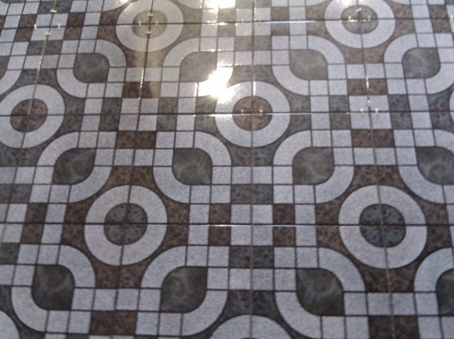
- it was planned to lay ceramic glossy tiles on the floor - it will add light to the room on a bright sunny day.
Under the ceramic tile on the floor, according to the technology, it is required to make a screed from a cement-concrete mixture. For fixing drywall sheets - special profiles.
In general, we have compiled a list of necessary purchases:
cement, seeded sand, sheets of insulation (expanded polystyrene), metal mesh for reinforcement, expanded clay, tile adhesive, fugue, profiles for fixing drywall sheets, moisture-resistant and laminated drywall sheets, paint, putty, and related fasteners ... and went shopping ...
First of all, all the furniture was removed, even the hob. Then they raised the entire floor - there were surprises waiting for us: dried corpses of rats in insulation.The entire surface of the floor was covered with glassine, covered with expanded clay (the height for pouring varied from 15 to 20 cm) and 3-centimeter foam polystyrene slabs were laid. Then, using a metal mesh for reinforcement, the entire area was concreted with cement mortar. The total area for pouring was 10 square meters. The time for "solidification" of this "pie" was about two days.
Floor concreting works:
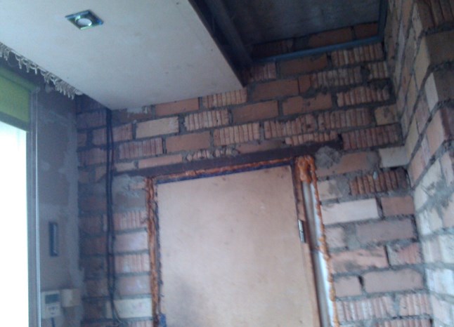
The second stage of our renovation was the finishing of the ceiling: on the ceiling, my son fixed "training" profiles for the suspended ceiling (on the walls, they were also partly there - you can see in the photo). They added additional fasteners and profiles throughout the entire area. We ran the cable for the electric lighting and screwed on the plasterboard sheets. The same procedure was carried out on the walls where it was planned to place the kitchen furniture.
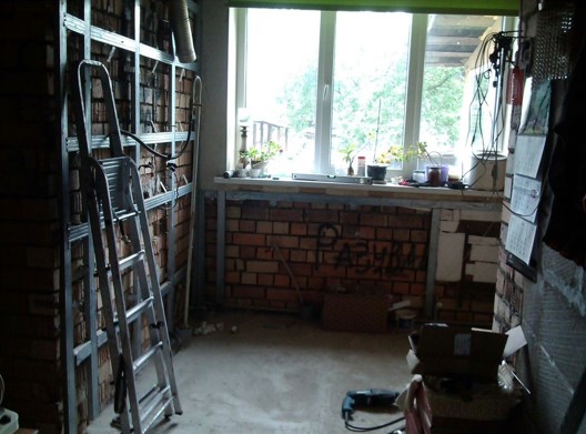
Premises before finishing walls, slopes and ceilings:
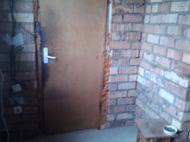
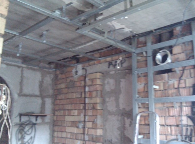
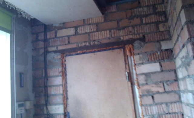
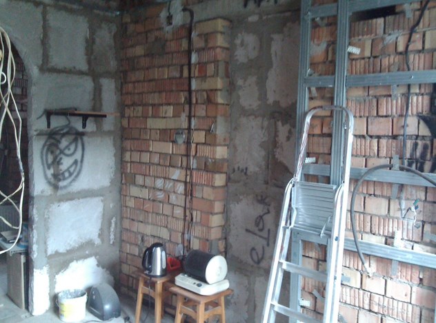
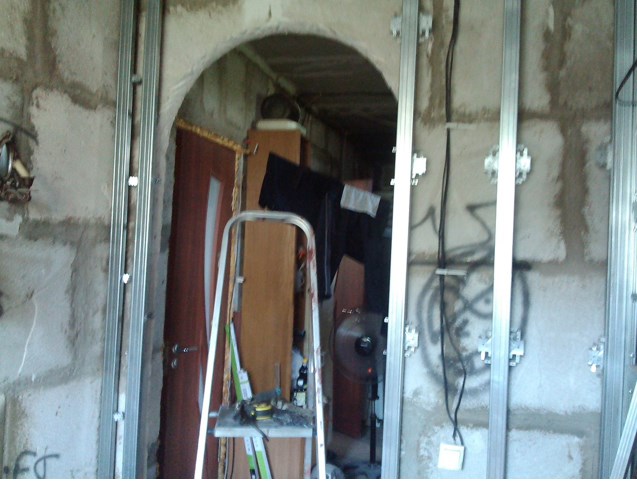
The walls in the area of kitchen cabinets, the slopes and the ceiling were plastered. The ceiling and slopes were painted. For the walls, they chose a warm gray color - neutral, non-binding. The shade was obtained by mixing a white base paint with a black color. For ceilings and slopes, the standard color is white. Washable water-based paint.
Now, after all the preparatory work and the "determined" room, it was already easier to choose options for the future design of kitchen furniture. I drew an approximate sketch in Adobe Corel Draw and 3D-Max programs (unfortunately, the printout of the screenshot has not been preserved). We went to the factories for the manufacture of kitchen sets.
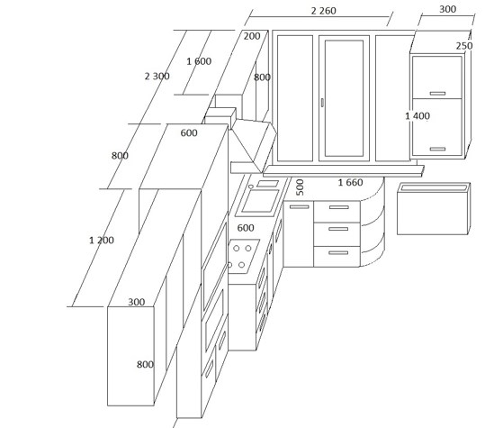
The layout of furniture in the room for the kitchen:
Sketch of the future kitchen furniture:
For the manufacture of a set of furniture in such a configuration, they asked for more than 1,000 conventional units in a version without plastic. A month later, having phoned almost all the firms in the city and the suburbs, they already started thinking about buying furniture ... in parts. We drove through all the exhibitions in the city and were practically in despair that we could not find anything suitable. But after two months our search was crowned with success. We found a company that entered into a contract with us for the manufacture of a set of kitchen furniture. According to our sketch, they asked for an acceptable amount of money of 1,050 rubles. (10,500,000 rubles in the old way, or about 500 conventional units in equivalent) and rather short terms were agreed. The colors of the facades were chosen, as well as the delivery date.
At the same time, the search for tiles on the floor and on the "working area" was carried out. Found quickly.
Workers were quickly found according to advertisements for tile laying services. Within a month, the floor and "working area" were prepared.
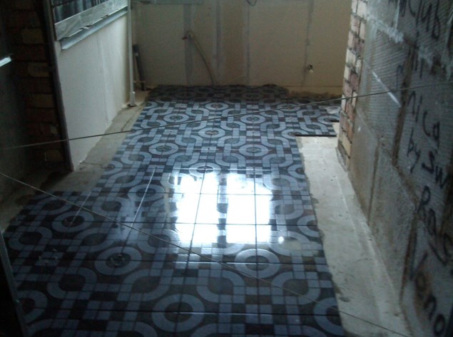
Laminated drywall sheets were glued to the wall with special glue. The joints were decorated with plastic E-shaped plates to match the colors of the laminated sheets. Installation of plasterboard sheets was carried out after laying ceramic tiles on the floor, since their dimensions are less than the length of the wall.
It seemed that there were only "little things" left: to bring and install kitchen furniture. It was here that the most unforeseen "obstacles" began ...
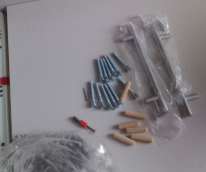
We did the assembly and installation ourselves - they saved 20% of the cost - a decent amount. All cabinets were assembled according to the diagrams and preliminary drawings. But not without the manufacturer's "jambs": somewhere in the kit there was not enough euro fasteners, somewhere door curtains, somewhere handles. In some places, design flaws were visible: the interior design was visible. (The color of the facade was different from the color that was used to decorate the interior of the cabinets). Fortunately, the manufacturer was not far from the house and, after the arrival of a representative of the company, shortcomings were recorded. Almost everything was fixed pretty quickly and efficiently.
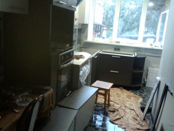
In one trip to the market, all the accompanying little things for decorative finishing were purchased: baseboards, corners, lamps, switches and sockets.The cost of these little things turned out to be unexpectedly high - a somewhat unpleasant nuance.
When choosing a sink with a tap, we opted for an artificial stone option in black or dark gray shades. They found a sink consisting of two bowls. The main one with a deep bowl, the additional bowl is slightly smaller. The kit also included the entire drainage system. The tap was also matched to the material.
A kitchen table with chairs was acquired by chance in a building materials store (fortune smiled). This set met all our requirements: the table legs are quite stable; soft chairs with a metal frame. The color matched the selected colors for the kitchen furniture.
We chose a decorative hood (according to information on the Internet), ordered it in the morning and by evening it was already mounted on the wall.
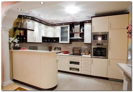
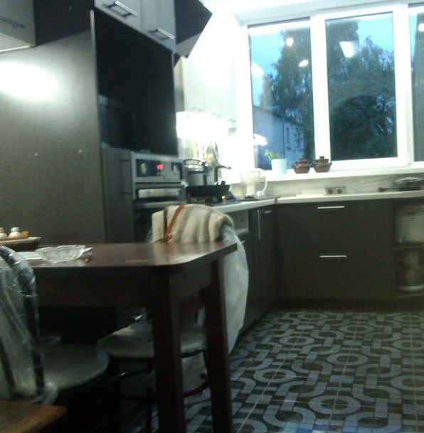
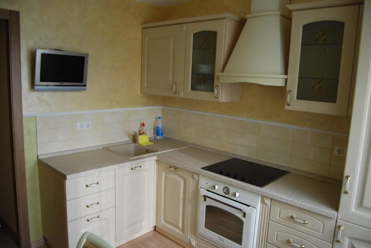
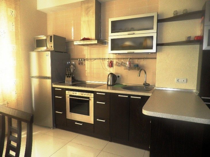
As a result, the renovation of the kitchen took about eight months. It seems to me that it turned out very well. Here is the result of our pride, which can now be admired:
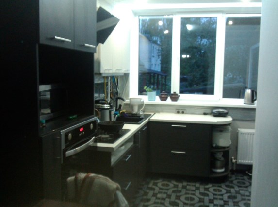
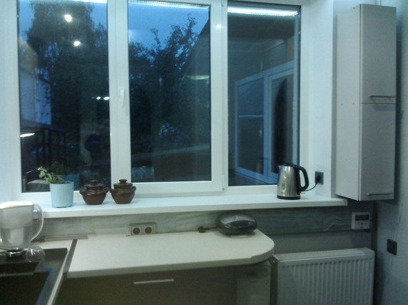
In the current age of advanced information technology, a lot can be learned. It is important to have the desire and the means.
To tell the truth, there are still some imperfections: choose ready-made or order blinds for the window; decide on the doorways ... But all this is connected with financing and the continuation of repair work in adjacent premises. And this is another story of repair. Now you can enjoy the work done and the comfort you have created with your own hands.
"The devil is not so terrible as he is painted."
Good luck to all. Regards, Veless
The arrangement of the kitchen in a private house differs in many respects from the design of the kitchen corner in the apartment.
As a rule, you have at your disposal a large area of the kitchen itself, as well as such pleasant "things" for the hostess as a cellar or basement.
Let's find out how to choose the right kitchen design in a private house and see photos of a wide variety of layouts.
The most beloved style trends among suburbanites are country styles.
Pastel colors, wooden furniture, textiles, ceramic pots, embroidered patterns, cute porcelain trinkets - everything will be rustic in your country cottage or country house.
Provence, a provincial style that originated in French villages the century before last. The interior is discreet, without any pretentious details, deliberately shabby and aged, with a kind of French charm.
The Provencal style is characterized by soft pastel colors. These are white, sand, cream, blue, brown, yellow colors.
From the drawings - flowers, irises, daisies, orchids, cockerels. Large and small, flowers on curtains, furniture doors, dishes, flowers in vases and pots.
All surfaces are processed only with natural materials. The walls are decorated with decorative plaster, facing stone or brick panels. On the floor there is wood, matte ceramic tiles, specially aged laminate.
Plastered ceilings, white or beige. The signature feature of Provence and country is wooden beams under the ceiling. Doors and windows are wooden and also with the effect of antiquity, light gray with floral paintings.
What about without decor? Under the ceiling are bunches of dried flowers, braids of onions and garlic, linen curtains on the windows, clay pots and plates on the windowsills.
And it is not at all necessary to have high ceilings and large windows. The unique spirit of French Burgundy will perfectly fit into your small town house.
The Provence style kitchen is fitted with wooden furnishings. Countertops, chairs, cabinets and shelves should look like they are a quarter century old.
Headsets from cherry, oak wood look good. The craquelure technique will age the wood with cracks and chips.
Pick up a bulky sideboard for the Provence kitchen, a massive table, and hide the microwave and toaster in the closet. After all, when this cute style was born, there was no trace of electricity.
And the most homely and cozy style for the kitchen can be called country.Comfort, warmth and simple atmosphere, in a word, everything connected with the village.
How to create a real country atmosphere in the kitchen of a city house? No metal-plastic windows, glass countertops and chrome-plated fittings!
We will hide household appliances in kitchen cabinets, decorate the walls with still lifes, place wicker baskets on the shelves, hang colored curtains on the windows, and cover the floor with woven rugs.
What other attributes of village life? Rocking chairs, wicker chests, clay jugs, a kerosene lamp, cans of cereals, wooden spoons ... These small accessories form the country style.
Most often, when developing a design project, kitchens in private houses adhere to the classic style.
The classics will never go out of style and are great for non-standard, combined and small kitchens.
In the design of a classic kitchen, designers use wood panels, textile wallpaper, parquet, laminate, ceramic tiles. Marble and granite countertops, stained glass doors, white stucco ceilings or painted stretch ceilings.
The classics love geometric shapes - a cage, a strip. Angular and linear headsets are preferred, furniture and appliances are arranged symmetrically. Kitchen appliances should not be conspicuous, let them be built-in.
It is advisable to choose furniture from natural wood. Headsets from Karelian birch, Carpathian beech, walnut, pine look very stylish. For a spacious kitchen, choose dark colors, for a small one, beige, cream, gray shades are suitable.
A round dining table, wooden chairs with high backs and leather inserts on the seats will look beautiful. There are sideboards, dressers, fireplaces, sideboards in a classic interior.
Replace blinds with curtains. Moreover, the color of the curtains should be combined with the overall color scheme of the kitchen. Fringe, silk tie-backs, massive cornices with vintage decorations are welcome.
If you have chosen a classic design for your kitchen, you love comfort and coziness, but still, you want a little modernity, we recommend neoclassicism.
Such an interior harmoniously combines the sophistication of the Middle Ages and modern fashion trends.
Neoclassic is the best design for a spacious walk-through or combined kitchen of a private house. The main requirements of this style are a large area and high ceilings.
Color palette: olive, cream, mint, gray, milky, without bright flashy details. The most popular shades today are the color of powder and eggshell.
In decoration, decorators prefer laminate and parquet, natural stone and light plaster. Carpet and linoleum will spoil the neoclassical style.
Combine classic and modern elements correctly. Match the massive, artsy chandelier with the LED recessed lights above the work apron.
Do not hide the refrigerator, gas stove, hood and dishwasher in furniture, but fit them into the carved frame facades.
Do not decorate kitchen windows with draperies and lambrequins. Light curtains of an even rectangular shape are suitable.
Kitchens stylized as classics will indicate good taste and high status of the owner of the house.
If you like light, uncluttered rooms, a lot of light, less furniture and all kinds of trinkets - welcome to the Scandinavian cuisine!
This style originated in Scandinavia. The harsh climate of this region is reflected in the interior of the kitchen. Simple austere furniture, a lot of light, both natural and artificial, light, sometimes even cold, surfaces and a minimum of decorations.
We will also call this style universal. Because it is suitable for any kitchen, living room, large dining room, summer kitchen or veranda.
Of course, the main color of Scandinavian design is white and all its shades. The white color freshens the walls and increases the small area.
To avoid the "sterile" effect, add a little beige, mint or lavender blotches to the interior. Make sure the furniture contrasts with the color of the walls. For household appliances, metallic shades are suitable, always glossy to reflect light.
Eco-friendly design is emphasized by light laminate, ceramic tiles in cold shades. Decorate the working area with mosaics, glass, wood panels.
In Scandinavian kitchens, there are always large windows and often no curtains at all. But still, for a private house, it is more practical to close the windows with curtains made of lightweight material.
Another nuance - many sources of artificial light. Chandelier, floor and spotlights. By the way, the lamps will become that bright color accent that will dilute the white space.
It was Scandinavian designers who became the founders of eco-style. The basis of the style is clear - absolute naturalness and safety.
What do designers recommend in the design of an eco-kitchen in a private house?
Use only natural materials. This means you will have to abandon plastic, linoleum. Choosing wood, stone, ceramics.
Wildlife motives. For example, on the walls and floors there are images of flowers, water, trees. And also live plants in ceramic pots, various compositions with shells, pebbles, etc.
Energy saving household appliances. Ordinary light bulbs do not fit into eco-style at all, so there is a maximum of sunlight from the windows.
We replace all plastic dishes, silicone molds, whisks and polymer boards with high-quality kitchen utensils, textile napkins, wicker rugs and bamboo blinds.
Let's face it, among the owners of private houses there are not so many fans of the loft style. Why?
Abandoned industrial and warehouse premises rebuilt for housing began to be called lofts.
Such dwellings, where high walls, a huge area and large windows, are loved by representatives of bohemians. Not very cozy, but original, and a great place for parties and concerts.
For lovers of the loft style, designers are advised to imitate a factory workshop in their own kitchen.
Build false pipes, beams, ventilation grilles under the ceiling. Furniture by the type of factory equipment. Materials - concrete, steel, wood.
Hi-tech means "high technology", so it is easy to guess that this style is based on the latest achievements of technology and science.
What is common between a kitchen in a private house and technical innovations?
There is a lot of glass, plastic and metal in such a kitchen interior. These are glass panels, false ceilings, metal surfaces, chrome pipes.
The main color is metallic. You can complement it with blue, yellow, black elements.
Furniture with clear, straight lines, no decor and romantic trinkets. And do not forget to remove personal and household items from view.
From technology - various engineering innovations, where everything shines, softly and silently drives in and out.
In many ways, we will be helped by tips from designers on how to arrange furniture and divide functional areas.
Soft tones, warm tones of furniture, walls and flooring will visually expand the space. A glossy stretch ceiling will make the kitchen even more spacious.
A dairy or black and white interior looks stylish in such a kitchen. Several bright accents can be added to the main light tone. For example, colorful blinds or a decorated countertop.
You can play with the lighting. Warm yellow lamps can constrict the room. But the central lamp with cold light, spotlights above the working area will make the room soft and cozy.
Another trick is kitchen cabinets with sliding doors and pull-out modules. Opened doors will not block the passage, and it will be more convenient for the hostess to move around.
In a completely uncomfortable small kitchen, you can buy cabinets with a depth of not 60 cm (this is the standard), but, for example, 50 cm. And the plates, pots will fit, and there will be a little more space.
It is not at all difficult to design a square kitchen. To begin with, we determine where the working area will be, take into account how many and where windows, doorways, arches are located and plan the interior.
If the area is small, a linear or corner furniture set, with a bar counter or folding table, will do. If there is enough space, an island structure will look beautiful in the center of the kitchen.
Large kitchen areas can be divided into several areas: a dining area with table and chairs, a seating area with upholstered furniture, a pantry for storing food supplies.
You can choose any material for surface finishing; in a square space, almost all design ideas look harmonious.
A bright kitchen apron, a contrast between a countertop and doors, and stylish accessories will fit well into a square kitchen.
Often in private houses, housewives are hampered by a large number of windows in the kitchen or dining room. To prevent windows and cornices from interfering with them, give up the usual curtains. Look for roller blinds, pleated blinds, roman blinds that attach directly to the window frame.
Consider such an interesting kitchen design in a private house - a photo of a kitchen studio.
If the house is designed so that a small kitchen is adjacent to the living room, dining room or hallway, then these rooms can be combined.
How to separate the kitchen area from the rest area? A beautiful bar counter, a sliding partition, a low plasterboard wall will serve as such a separator.
Divide space and floor level difference, different wall colors or lighting. For example, the kitchen has tiled floors and the dining room has laminate flooring. Or in the kitchen there is a bright light, and in the living room - soft dim.
The main secret of the studio kitchen: the style of the kitchen area should be in harmony with the interior of the dining room or living room. Therefore, it is important to correctly arrange household appliances, furniture and decorative accessories.
Rarely, but still, there is such an option in private houses - a kitchen combined with a hallway or corridor. What can you do if the kitchenette is so small that only a stove and a sink can fit there.
To make such an interior beautiful and cozy, use different finishes for the ceiling, walls and floors. Divide the room into zones: for the kitchen - bright facades, multi-level ceilings, for the hallway - practical floor coverings or grates.
Make the most of built-in lockers, movable or mobile units. Rationally design lighting: for the kitchen area - a bright, abundant light, and for the hallway itself - wall sconces, floor lamps.
Perhaps the most important task in arranging a kitchen hallway is to ensure hygiene and cleanliness. Indeed, on some square meters food is being prepared, kitchen smell and street air, dirt, wet footprints, clothes and shoes "fly".
Is there a walk-through kitchen in your house? Quite often, you can see kitchens in private houses with two exits (to the veranda, personal plot, farm buildings or to another courtyard).
Of course, it is not very convenient to cook and eat if households constantly run past the table to another exit. Take a look at some of our tips.
We place the furniture so that it does not interfere with the passage. No sharp corners or steps on the way to the door.
We clearly limit the working area for the hostess. We divide the border between the aisle and the kitchen itself with a high rack, a large kitchen set or a dining table.
Let's take care of additional illumination of the working area.
Well, have you figured out all the features of arranging a kitchen in a private house? Let's get down to interior design and decoration!
In a beautiful and stylish kitchen, you want to cook culinary masterpieces, surprise your family, please your loved ones and receive guests. Have you already chosen your kitchen design?
Your repost will change the internet 🙂
It was possible to start repairs, sending the whole family to their historical homeland.In order not to be so boring to be engaged in repairs, I decided to take pictures along the way. What if my experience is useful?
So, it WAS: an ordinary smoky gray room with an area of 6.5 sq. m (I forgot to take a picture, excuse me).
I wanted something cool and loft, but money was running out.
The first two days I studied the assortment of Ikea, Leroyamarlene and Obi and tried to compare my desires and possibilities. The results were not very encouraging, so first I decided to dismantle everything old.
To start repairs, you need to disassemble everything old, unscrew and drag the necessary one into the next room.
I took out 5 heavy bags of tiles from the walls to the trash heap. As luck would have it, the elevator was not working.
Tried to get close to the wiring to do it the way I need it.
Finally, we managed to clear the last wall of wallpaper. The war was fought for every centimeter: the hellish mixture of glue, which becomes terribly slippery from water, left me practically without hands.
This wealth of textures of the peeled wall, on which time has worked great, inspires me terribly. I would live alone - I would ask the designer to arrange such walls.
The ceiling has already been made, the walls and furniture remain. I decided to leave the working area above the stove as it is.
And our ceilings are crooked. The door frame is level.
Having cleared the paint from the windowsill, I saw such a stunning color that my hand did not go up to paint it back. And I will choose the color of the laminate to match the color of the window sill.
I could not find a lamp suitable in size and price in stores. Converted an old chandelier. Here is the result.
Fit new doors to the mezzanine
The most interesting thing is that the last stage of the repair was the most protracted and costly. Hanging furniture, connecting a washing machine, shelves, hooks and other little things took more time and money than the repair itself.
To be honest, the impetus for the start of the repair was the dream of such a faucet (switching modes, retractable spray) and a sink.
This is how our kitchen began to look after renovation:
The concrete was thoroughly washed and covered with wax from Ikea
I decided not to glue the wallpaper, I painted the walls with water-based paint. Covered on top with mother-of-pearl enamel from Leroy. And it is pleasant to the touch and washes perfectly.
Panorama of the kitchen after the last changes and improvements
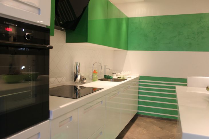
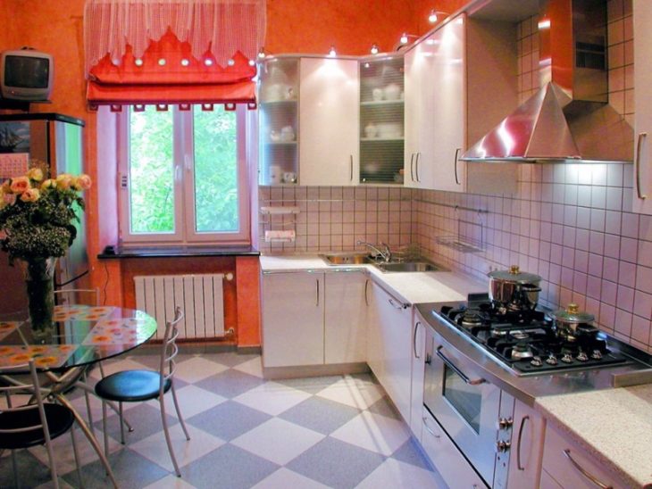
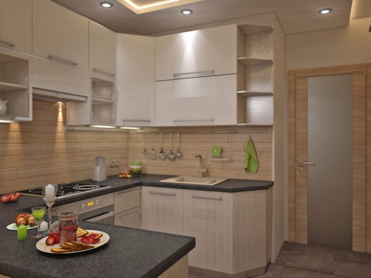
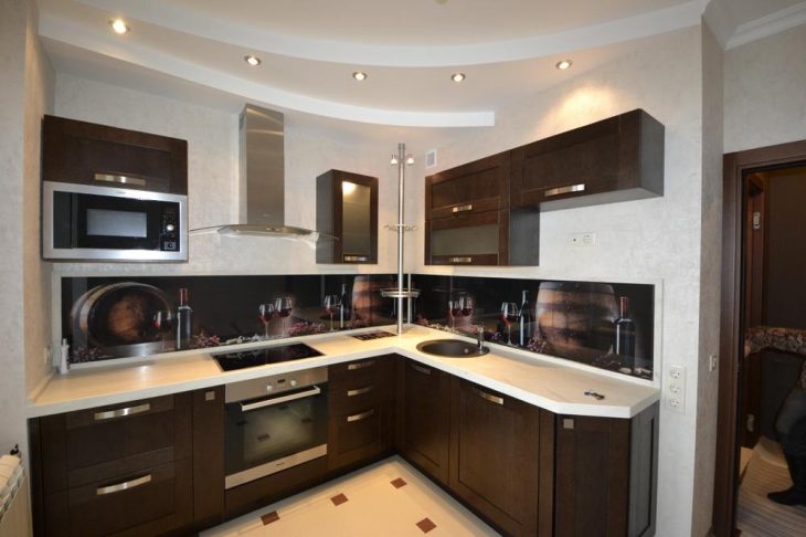
In the kitchen, every woman tries to show imagination and ingenuity in preparing food for her family. The kitchen plays a vital role as the heart of the home. The home coziness that the kitchen creates encourages every household member to look there more often. Kitchen renovation options photo - 70 design ideas:
It is in the kitchen that friends who accidentally drop in for tea with cookies get to. Therefore, every housewife wants the kitchen to feel a pleasant atmosphere of warmth and comfort. Renovation of this part of the house is becoming an important and serious step. Especially, this applies to those cases when the owners themselves take responsibility for the inexpensive repair of a small kitchen.
In order not to delay the repair in the kitchen for many months and to get pleasure and emotional relief from this process, it is necessary to adhere to certain tactics in actions.
Create a design project for the future kitchen. Making repairs without a previously calculated plan can lead to excessive worries and costs. If you draw up an estimate, it is possible to fit the repairs into the established financial boundaries and understand where you can ultimately come.
To create a design project, you can contact a professional designer. Taking into account your wishes, the designer will provide you with several types of project, and you can choose what you would like to see for you. Your task is to think over the colors, furniture placement, style and lighting of your kitchen. Kitchen renovation real photo examples:
You can do with minor repairs to maintain the cleanliness of the room, or make major repairs, or you can perform a complete redevelopment of the premises and change your favorite corner of the house to an amazing state.
Clear the area and disassemble the previous finish. When a design is selected, you need to remove household appliances and furniture from the kitchen. You can easily part with unnecessary items and old lockers. Then proceed to disassemble the trim on the ceiling, walls and floor.
Plumbing is one of the most important stages in the renovation of any kitchen. Especially if the plumbing equipment needs to be completely replaced with a new one. Pipes must be placed close to the walls, or mounted inside the walls. Replacing the cast iron battery with the latest aluminum system or convectors would be ideal.
For the pipeline, polypropylene, metal-plastic, copper are used. These materials have a number of advantages:
-
- - polypropylene pipelines have low thermal conductivity and corrosion protection. No need for cuffs and linings. Differs in a democratic price. You can install it using a welding machine.
-
- - metal-plastic pipes do not lend themselves to corrosion, are characterized by low heat transfer and a rigid structure. Installation of metal-plastic pipes is quite complicated and requires a large number of components.
- - the highest indicators of durability, tolerance of very high and low temperatures, resistance to deformation and other external reasons in a copper pipeline. Copper has antibacterial properties. The disadvantage of copper pipes is their high price. Kitchen renovation options photo:
When replacing electrical wiring, it is important to take into account the workload of the kitchen with various electrical appliances - a refrigerator, an electric kettle, a microwave oven, a washing machine and others.
It is better to lay a separate electrical line with a sufficient number of outlets.
In addition to the main lighting, additional lighting is also needed. These can be spotlights that will illuminate all the required areas of the kitchen. If you want to make a general replacement of wiring or install gas equipment, then the best option would be to use the services of professionals.
Modern kitchen renovation involves replacing the window, and it is important to decide which window you want - wood or plastic. The quality of a wooden window is environmentally friendly, natural and able to "breathe", but the price of such a window is high.
Plastic is more solid, resistant to temperature changes and other hostile circumstances, does not need additional care. Also, the PVC profile in combination with a glass unit creates excellent sound and thermal insulation.
Consider all types of room ventilation when replacing a kitchen window. Install such a sash so that it is as practical as possible in operation. Kitchen renovation photo ideas:
The kitchen doors can be ordinary, or you can make an arch. There are plastic and wooden doors. Plastic doors do not crack, are not prone to deformation, are sealed, moisture resistant, have high sound and thermal insulation.
Renovation of a kitchen in a one-room apartment, the prices of plastic doors are quite reasonable. But plastic wooden doors are still inferior in naturalness and environmental friendliness.
With the help of the latest technologies, it is possible to process the tree so that the highest possible performance properties are achieved.
The arch can be made of drywall, or it can be made of wood. The main thing is that this element is in good harmony with the overall interior.
Inexpensive repair of a small kitchen, when starting to level the walls yourself, you need to pay attention to two methods. You can level the walls using drywall or plastering.
The methods have both pros and cons:
-
- - it is not difficult to install drywall and this process does not take a lot of time.You can form even, even walls and hide the differences in surfaces using drywall. The disadvantage of drywall is a significant reduction in the size of the room, and the drywall wall comes out empty and sonorous.
- - if you use plaster to level the walls, you can eliminate unnecessary gaps between the finish and the wall. And in the end, get a smooth, coherent surface. But in rooms with large differences in surface levels, wall decoration with plaster is impractical, this is due to the painstaking process and rather high material costs.
No kitchen is complete without the design of the "apron". The apron is intended to be a protection and decorative element of the gaps between surfaces and wall cabinets. Common methods for finishing an apron are:
-
- - plastic panels. An affordable and suitable option for self-repairing a kitchen. If you make a good choice of the color scheme of the panels, you can get a fairly practical coating, the care of which will be quite simple;
-
- - tile is a hygienic and long-term finishing option for the "apron";
- True, the tile is painstaking in laying and significant financial costs will be required;
- - mosaic or artificial stone - a specific option in the design of the kitchen. Exclusivity and high price are guaranteed. It is better to entrust the work with these materials to professionals.
- - a non-standard solution would be the choice of a mirror or glass "apron".
Having an idea of where to start renovating a kitchen, you can step by step get closer to your dream. Kitchen renovation options photo - 70 design ideas:

